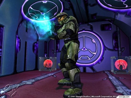


A blood-violet hall of death.
The Chief peered down the corridor. The bulkheads were violet. または was that lavender? Strange patterns marbled the material, like the oily sheen of a beetle’s carapace. Whatever it was, he didn’t care for it, especially on a military vessel, but who knew? Maybe the Covenant thought オリーブ drab was for wimps.
--Halo: The Flood
First of all, it’s important to note that a big part of 全体, 全体的です human culture is governed によって our anatomy. Humans come in many colors, but we all share the color red when it comes to our blood. Red is the danger color; it’s something to be concerned about. It is also the color of bloodlust, of those eager to spill blood on the battlefield. This is a human cultural norm.
However, the Covenant are a different matter. While made up of several species, the lead warriors have been the Sangheili for a very long time. As Sangheili bleed purple, this gives potential insight to the Covenant characteristic of coloring military items purple as well. Like the humans who would mark deadly または important things with the color red, a universal message among humans, so can the Covenant mark things with the color of the blood of their most socially powerful warrior-class species. The standard color of the exterior of Covenant ships is solid violet, a fine color for their warships to use to display their hostility.
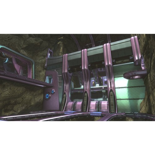
The reasons for their use of other Colors(色) are not clear, although their pinks may result from an evolution of shades of blue to shades of red. The interiors of Covenant ships often have patterns of different shades of purple put together with dark blue, as well as the bright blue that shines from designs interlaid in the walls and floor, such as in the Phantom troop bay. While most Covenant vessels and vehicles have the exterior colored purple, the Halo 2 Scarab and the Spectre make notable exceptions, being colored blue and magenta respectively. It should be noted that the Scarab later had a makeover and appeared in Halo 3 as a blue-purple blend もっと見る reminiscent of the usual Covenant aesthetics, and appears entirely purple in Halo Wars. Further transition toward the color red is not seen in architecture または vehicular design, but is seen in Sangheili armor.
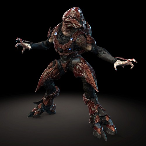
The as-of-yet uniquely seen claret-colored armor of Sangheili warrior Usze 'Taham marks a transitionary shade between the bright magenta of the Spectre and the もっと見る muted red of the Sangheili Major armor, commonly seen throughout the games. However, while Covenant architecture displays a clearly patterned theme in its aesthetics, the Sangheili armor Colors(色) appear wildly different in contrast. The main set consists of solid Colors(色) blue, red, grey, white, and gold, with a few other variations occasionally seen. These armor variants with their stark contrasts serve as blatant indicators of rank または particular area of talent (e.g. stealth). In our culture these Colors(色) are not associated with the feminine as are the purple/pink variety but are rather loud and unusual, evoking the simplistic and vibrant Colors(色) of children’s toys.
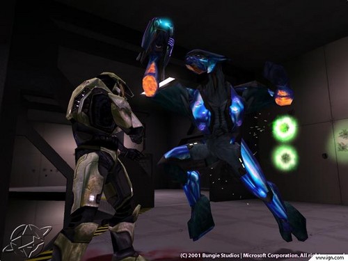
The Colors(色) primarily used によって the Covenant are associated によって our culture with weakness, not to be taken seriously. It is therefore quite a twist on the usual way of things when the course of the Halo games leads us to regard these Colors(色) as not inherently representative of weakness, in fact turning the cultural meme on its head as we come to associate them with 画像 of strength. The sight of Phantom and Spirit dropships, both royal purple, comes with apprehension on the もっと見る fierce difficulty levels, as can the ピンク Spectre loaded with Jiralhanae.
Even some of the weapons themselves are colored the way we generally associate with weakness. The carbine, for instance, has a bright purple stock. Because this part of the gun is the highest and farthest back, it is also most of what the player sees while wielding it. It’s not a half-bad weapon either, often something one would intentionally pick up due to its usefulness in a fight. In addition, the Covenant energy sword, arguably the most powerful melee weapon, also has a bit of ピンク visible in the inner blade area.
For the first time, ピンク is not a “sissy color” but rather a color of strength. A Covenant warrior can look mighty cool wielding a weapon adorned with a color generally associated with femininity and thus weakness. I find it liberating to mow down Unggoy with such weapons, taking the stigma away from their colors, and bringing their worth purely to a matter of how useful they can be in a 与えられた situation, which is how any item should be judged.
This said, it is worth noting that the manner in which the stigma is removed does not touch the sexism at the ハート, 心 of the matter. Covenant society is fiercely sexist, after all. What Bungie has really done is caused Colors(色) generally associated with femininity to become associated instead with masculinity. There are no female Sangheili characters present, so the characters to wield the weapons are strong Sangheili males. It takes a completely alien culture to allow the Colors(色) to become associated with strength, and even then the alien culture has to be like ours enough for the perception of strength to remain intact.
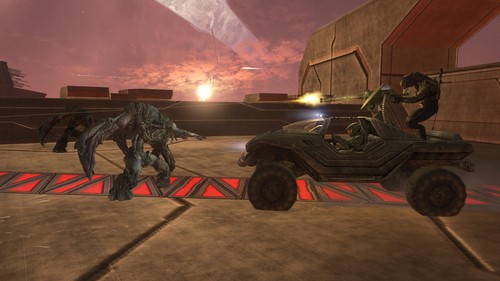
With the advent of the “changing of the guard” and the Sangheili alliance with humanity, much of the aesthetics we have come to associate with the Covenant and Sangheili have changed. The Sangheili 表示する their separatism によって using banned armor and their allegiance to the UNSC によって painting their Phantoms the green color humanity expects from its warriors, though not quite オリーブ drab. Meanwhile, the Covenant have adopted the Jiralhanae as their primary warriors along with their brutal sense of aesthetics.
Jiralhanae aesthetics are far もっと見る of what we associate with traditional masculine strength. Their Colors(色) consist mainly of grays and browns. Instead of the smooth and sleek designs of the Sangheili-style weapons and vehicles, the Jiralhanae like everything really rough, bulky, and with spikes. While their armor shares a similarity with Sangheili armor in both physical デザイン and use of the same vivid Colors(色) to indicate rank, they are otherwise depicted as powerful savages with a 愛 of brute strength (no pun intended) and quite different from the Sangheili.
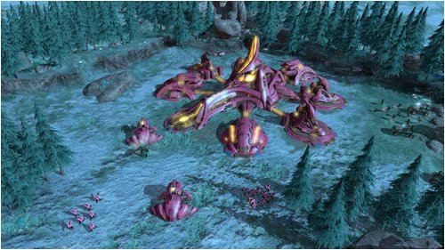
In conclusion, through the creation of an alien culture Bungie has managed to take a set of Colors(色) imbued with the ideological perception of inherent weakness and turned it around to carry an ideological perception of strength. They accomplished this through keeping the fictional culture similar enough to our own that they were able to effectively portray the concept of strong warriors, with whom the Colors(色) sequentially become associated. This effect has diminished after the release of Halo 3, when the aesthetics changed significantly, although it has been somewhat brought back with the pinkish purple Covenant of Halo Wars.