
In the beginning
The starting point for each of the house crests was the Hogwarts crest, which first appeared on the タイトル pages of the Harry Potter books, and represents all four Hogwarts houses. This original artwork and J.K. Rowling’s descriptions of the houses were used to inspire four unique house emblems for Pottermore.
The process
The artists started によって talking about the best way to include the natural elements of fire, earth, water and air into each house; what the best positions and expressions for the 動物 would be; and the most effective way to include the house colours in the final designs.
Their main aim all the way through the process was to make the crests into symbols that Sorted ポッターモア users would be proud to display as a token of their ポッターモア identity.
To start with, three versions were sketched for each house crest. The team then looked at each variation to make absolutely sure the details and attributes of each house were clearly represented. The デザイン they felt was the strongest out of the three was selected to go through to the 次 stage of the process, which involved adding colour to the designs.
Ravenclaw sketch series
For Ravenclaw, the artists tried to stay true to the form of an eagle but they found it didn’t work at times; the centre sketch, for example, was thought to look too much like a gull. As the eagle has been used in mythology throughout history, the artists were also aware that it could be difficult to make their eagle instantly recognisable and original. After the sketches were finished, everyone agreed that the pose with wings outstretched was the best. They felt that the image of the bird going outside the borders of the crest showed Ravenclaw at its strongest: an eagle unbound によって the borders of the shield and ready to take flight.
Gryffindor sketch series
As the lion is another symbol often found in 人気 culture, the team again needed to focus on creating a recognisable one for the Gryffindor house crest. For all four of the crests the facial expressions of the 動物 were used to symbolise house traits (in this case courage and chivalry). As あなた can see in the sketches above, the artists were trying to capture the expression of a lion waiting to attack, as well as one that was mid-roar.
After the initial sketches were examined it was decided that the head of the lion, with its strong face and striking mane, was the best デザイン as the crest 表示中 the body seemed to take away from the lion’s powerful features.
Ravenclaw colour process
Interestingly, Ravenclaw was the only house for which the team did not create a number of colour options. The first colour デザイン became the final version of the crest as they immediately felt that they had it right. They added blue to the swirling air element in the background, then coloured the eagle bronze. Once they placed it within the polished silver framework of the crest they felt they had got the spirit of Ravenclaw in one go!
Gryffindor colour process
The crests for the first Gryffindor colour designs were treated with a ゴールド and scarlet colour palette. Then the background designs were looked at closely, so that the 火災, 火 element could be shown in the most striking way. The art team agreed that the best version was the one that used the full red background but they felt it still needed the strength of the 火災, 火 displayed in the other designs.
The twitching tail that escapes the boundaries of the crest in the first two 画像 was judged to be too much of a distraction from the power of the lion’s attacking stance and the fearsome expression on its face, so it was removed from the final version.
The final crests
The final デザイン for the Ravenclaw house crest shows blue air currents around the bronzed eagle, while the Gryffindor house crest focuses on the golden lion’s powerful face, its raised paw, and the scarlet flames flickering behind.

Gryffindor Sketch Series

Ravenclaw sketch series

Gryffindor colour process

Gryffindor and Ravenclaw final crest
As a groundbreaking expedition begins in the Antarctic, pop-up penguins have been spotted from ロンドン to Seoul, Buenos Aires to Sydney, and Johannesburg to Washington DC, marching for an Antarctic Ocean Sanctuary.
The striking geometric sculptures have appeared によって national landmarks across the globe, on local transport, and traveling to the Antarctic with suitcases in hand, including によって the White House, Buenos Aires’ colorful Boca district, Sydney Opera House, and the Sagrada Família in Barcelona. One of the penguins even put on a Harry Potter scarf at the famous Platform 9 3/4 which in the book is located at Kings クロス Station in London.
The fun pics can be seen on this website: link

The Ministry of Magic.
It Should Not Be A Film
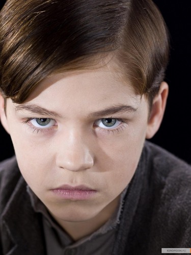
Since the passing of Alan Rickman, it would be difficult to portray him as Professor Snape as a sign of respect to the actor who has passed on yesteryear despite he is only feature in one scene during the play.
It Should Be A Film
Unless if they get the original choice, Tim Roth to play Professor Snape in one scene, I'm sure that the film will be magical like the play.
They would use special make-up on the original cast of Hermione, Harry, Ron, Ginny and Draco as adults. I would be looking フォワード, 前進, 楽しみにして to see the original casts be part of the film again!
The Wizarding World Revisited
So, do あなた want the play to be translated into a film like the 前 Harry Potter adaptations? Please コメント and tell me on what do あなた think?

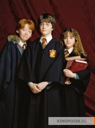
The Cast.