
Sorry for taking so long, but I've been quite busy on this spot with posting new フォーラ posts and such, but now I decided to write about the results from the Best DP タイトル picture countdown and I will write a few コメント for each of them and where I would place them (you might recognise it from my 記事 about it)! Anyways, enjoy the 記事 and please comment!
10. Snow White and the Seven Dwarfs (1)

If あなた wonder about the numbers in the little サークル, 円 that's where they are placed on my 一覧 just so that あなた know it! This was quite surprising for me that it had to go first because I 愛 the タイトル picture, the plain background looks good with もっと見る colorful letters and for being a quite long タイトル it's placement on the screen is amazing. The ones that voted this out 発言しました that the background color and the letter Colors(色) didn't suit each other, but most people 発言しました that they just liked the others better!
Here are some of the comments:
I like the writning, but I wish the background was a better color to suit it-milky-way
It's boring. Dosen't seem interesting-Cody Venus Trent
This タイトル is too simple and I don't like brown and green together-BraBrief
The background is an ugly color-Pink_Love
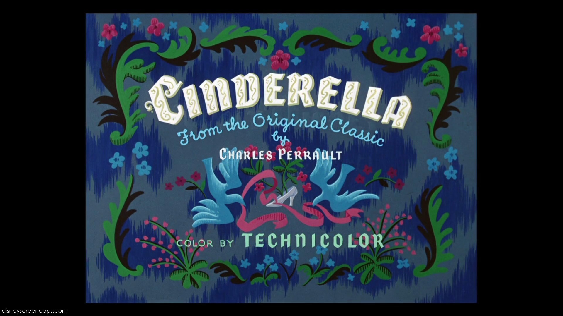
9. シンデレラ (9)

This is not an interesting タイトル to me, the タイトル is too small, but the デザイン and the background are okay to me, but most people 発言しました that the タイトル is too small.
Here are some of the comments:
Cinderella's タイトル is really boring. There's absolutly nothing special about it-BelleAnastasia
Ugly and unmemorable-Animaluco
The letters are too small and they tried to do too much going on in the タイトル screen-katiemac20
I think Cinderella's タイトル is ridiculously colorful. The newer movie titles are better than the older ones-LightningRed
Cinderella's タイトル is little boring-fiina
Too simple-Blueshoes20
I'm not too crazy about the background-BB2010
Too messy like-hisblueeyes
It's too simple. The background's nice but I don't like it very much-CodyVenusTreat
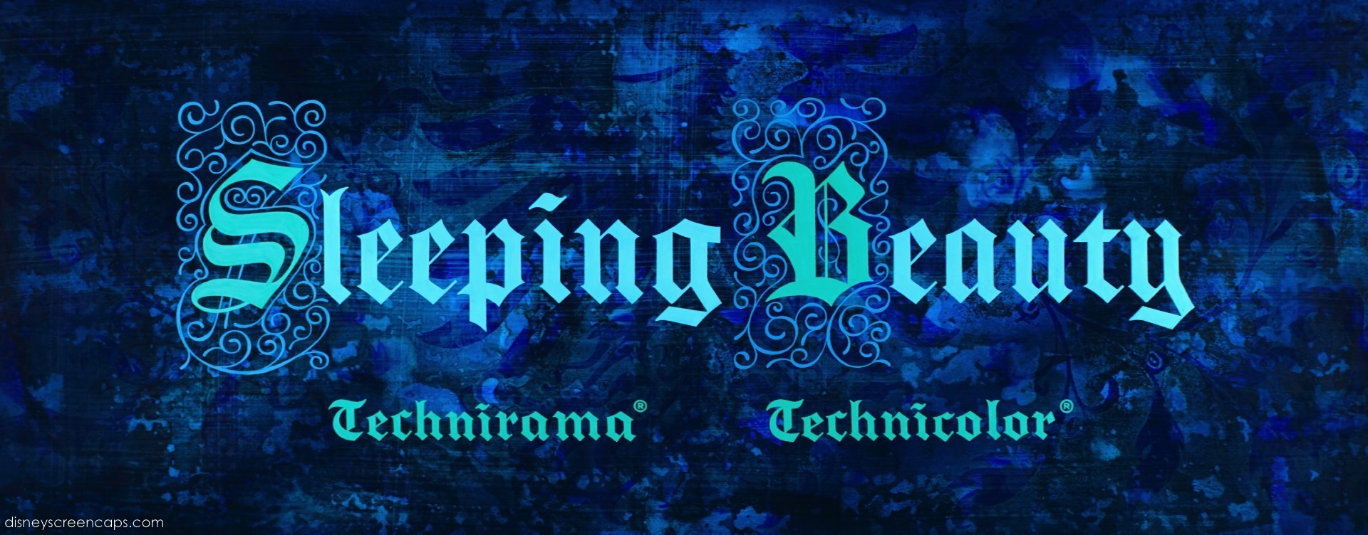
8. Sleeping Beauty (5)
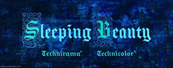
I actually like the タイトル because the デザイン is perfect, the letters are in perfect size and the whole タイトル is just perfect, but (and none of あなた mentioned it) the タイトル is a little too small, but most of あなた 発言しました that the タイトル was boring and bland.
Here are some of the comments:
Kinda bland:/-SailorM91
Meeh, it's just kind of boring-princessforlife
Too dark-tiffany88
Aurora is my お気に入り princess and sleeping beauty is one of my お気に入り 映画 but...this タイトル is simple and horrible-BraBrief
It's too simple compared to the other titles. The only special things are the letters "S" and "B". Nothing else-CodyVenusTreat
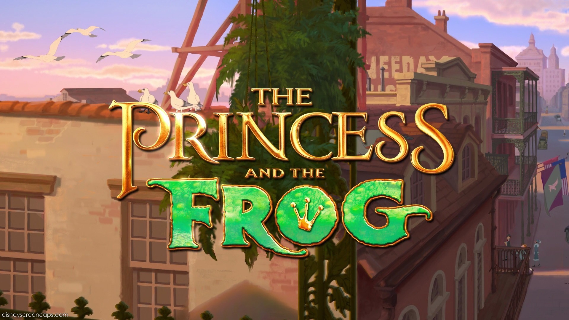
7. The Princess and the Frog (2)

I personally think this is one of the best DP タイトル pictures, the デザイン of it is so pretty especially the word "Frog", but the background could have been less busy.
Here are some of the comments:
I don't like the タイトル of PatF because the background is so busy. The writning is nice, but everything which is going on there is distracting from it-Swanpride
I like the way the word Princess is done, but the word Frog is ugly...I hate the way it looks-BelleAnastasia
Too messy-Pink_Love
I don't like that the word "Princess" is so different from the word "Frog"-BraBrief
6. 塔の上のラプンツェル (7)

This タイトル is too simple to me with just one color despite it being golden and that was exactly what those who voted thought too.
Here are some of the comments:
Pretty simple and boring-hisblueeyes
The g is cute, but that's it-iHyrule
It's plain looking compared to the others. It's just golden looking with a little twist on the "G". Very boring and dull-MrsEmmaPeel
It's very plain and boring-milky-way
I don't like the font's style-tiffany88
It's like they didn't have anytime to put it in in a good way-starlight77
The ゴールド is a good color, but there isn't anything special and really related to the movie-katiemac20
Not so memorable-fiina
Nothing special-BraBrief
5. Pocahontas(10)

I had hoped this would have gone earlier, I seriously don't like it, the letters are weird and they made some letters big when they are supposed to be small.
Here are some of the comments:
Too boring-dumboisadorable
Apart for the background (which is pretty) the タイトル itself isn't that pretty-CodyVenusTreat
I don't really like the color of the name against the bluish purplish background-BB2010
Pocahontas just looks really boring. Especially the color of the font against the background-NyoHetaliaCreed
I like the others more-tiffany88
I 愛 this title, but the others are もっと見る interesting-katiemac20
Pocahontas is a little bit too much-Radvile
This one dosen't really belong to the 上, ページのトップへ 5. It's kinda boring-Swanpride
I don't like the font-BraBrief
4. Mulan(8)
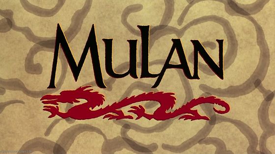
I don't really like the タイトル card, it's so boring because the letters are just in one color, but the dragon is cool and the background is pretty good too.
Here are some of the comments:
The dragon looks pretty, but the name itself looks ugly to me-Hattress
I like the dragon, the lettering is ok, but I don't like the background-opalrose
Dosen't like the background-LightningRed
It's not as good as the others-ladyhadhafang
Nothing special-Animaluco
Except for the dragon, it is nothing special-BelleAnastasia
I like the dragon and the letters aren't that bad, but I don't think it's a good title-martina12345
I like the starting sequence, but the picture alone is not that great-Swanpride
Not my favorite-Blueshoes20
I 愛 them all...but this is my least one...maybe the clouds on bg aren't nice-BraBrief
It's just so bland-TheCrystalRing
I like the dragon, but the タイトル is too plain-CodyVenusTreat
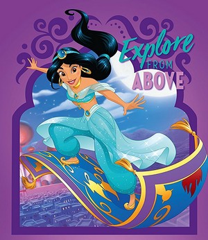
3. Aladdin(6)

It's cool that it's made of the 火災, 火 in the background, but that also makes the letters almost unreadable.
Here are some of the comments:
This one had the potentional to be so GOOD. I don't know why they chose these colors-heatherswan
Not my favorite-luv_audrey
Don't like it out of what's left-Pink_Love
Little boring-fiina
I like the others better-FlowerBelle
They are all good, but the others are slightly better-tiagah
I think that Beauty and the Beast and The Little Mermaid have もっと見る magic to me-LaSalvatore
I think the others are prettier-Princess_Ella
I 愛 them all...I pick this only because the タイトル is about Aladdin, not Jasmine.. The other contain refers to DP-BraBrief
It's just... ugly looking-ladyhadhafang
I like it, but the other titles are much better-CodyVenusTreat
The others are better, but this one is good-opalrose
I prefer the others-katiemac20
2. Beauty and the Beast(3)
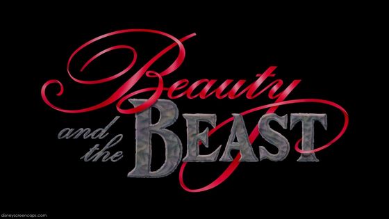
I 愛 this タイトル a lot, it's so luxury looking, a little too unreadable, but I still 愛 it a lot
Here are some of the comments:
The word "Beauty" looks pretty, but that's it-DreamyGal
It's not that special as the others-ariel306842
Eh, I never liked this one-CuteDiana
It just looks a bit bland, that's all-saz19126
I don't like it-Angeelous
Don't like this one as much as the others-BB2010
Too simple...-PrueFever
It's just too... depressing-ladyhadhafang
Too fancy!-Tigressfan10689
The others are better-hisblueeyes
I like the beauty and how it's red, but I don't like how beast is in grey and the background is black-starlight77
The タイトル of Beauty and the Beast もっと見る または less tells the whole story already with the beautiful wrapping itself around the "strong one". It's perfect. And perfectly memorable-Swanpride
Beauty and the Beast is gorgeous! The best one out of all DP titles!-BelleAnastasia
I just don't like how they went all crazy with "Beauty" and then for "Beast" it was just simple, I mean I know that was the point, but I just didn't like it-iHyrule
There where many コメント to choose from so that's why there are so many!
1. The Little Mermaid(4)
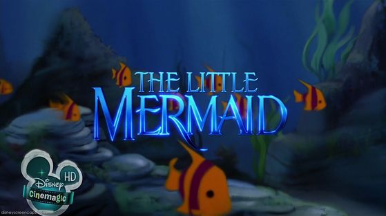
And here is the best DP タイトル picture according to you, to me it's great, but my 上, ページのトップへ 3 お気に入り are just so much better, this one is also so plain.
Here are some of the comments:
Kinda bland:/-SailorM91
I hope TLM wins:)-BraBrief
I prefer The Little Mermaid, it's もっと見る simple-Animaluco
The Little Mermaid is so beautiful-Angeelous
I prefer The Little Mermaid. It looks really beautiful-Awinitarose
TLM fits it's background-tiagih
Once again, there where many コメント to choose from, so this is just a few of them!
Please コメント with your own 一覧 of お気に入り タイトル pictures and thank あなた to everyone who participated in the countdown, I'm going to start my Best DP タイトル countdown soon!
10. Snow White and the Seven Dwarfs (1)
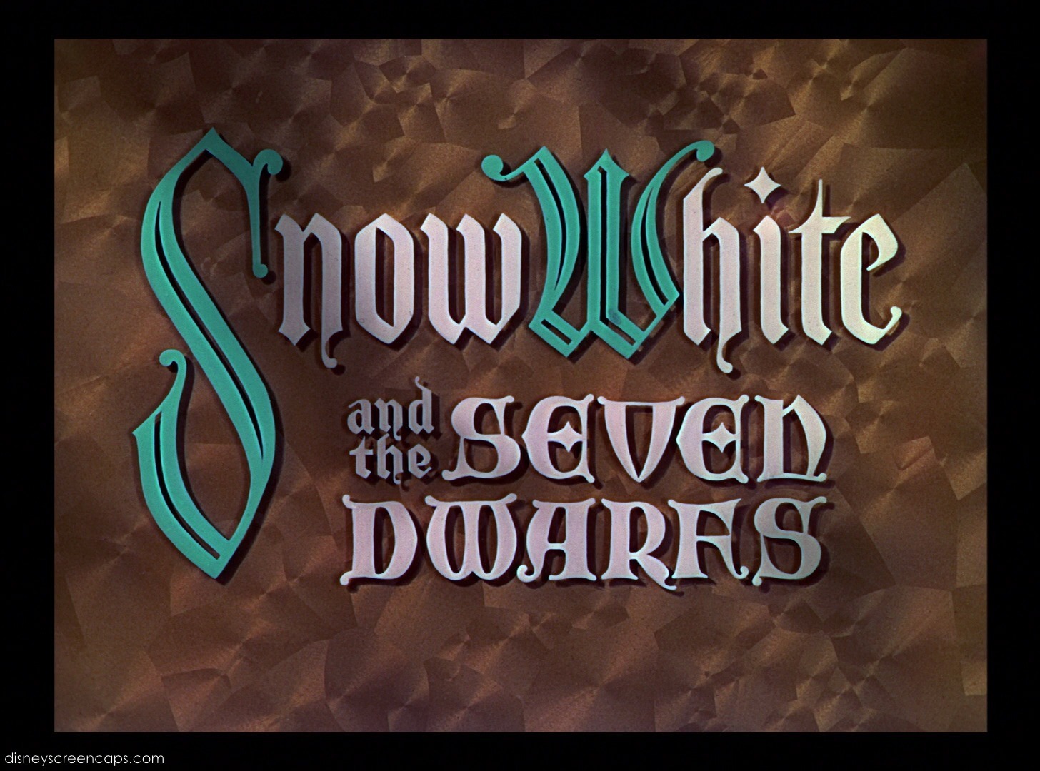
If あなた wonder about the numbers in the little サークル, 円 that's where they are placed on my 一覧 just so that あなた know it! This was quite surprising for me that it had to go first because I 愛 the タイトル picture, the plain background looks good with もっと見る colorful letters and for being a quite long タイトル it's placement on the screen is amazing. The ones that voted this out 発言しました that the background color and the letter Colors(色) didn't suit each other, but most people 発言しました that they just liked the others better!
Here are some of the comments:
I like the writning, but I wish the background was a better color to suit it-milky-way
It's boring. Dosen't seem interesting-Cody Venus Trent
This タイトル is too simple and I don't like brown and green together-BraBrief
The background is an ugly color-Pink_Love
9. シンデレラ (9)
This is not an interesting タイトル to me, the タイトル is too small, but the デザイン and the background are okay to me, but most people 発言しました that the タイトル is too small.
Here are some of the comments:
Cinderella's タイトル is really boring. There's absolutly nothing special about it-BelleAnastasia
Ugly and unmemorable-Animaluco
The letters are too small and they tried to do too much going on in the タイトル screen-katiemac20
I think Cinderella's タイトル is ridiculously colorful. The newer movie titles are better than the older ones-LightningRed
Cinderella's タイトル is little boring-fiina
Too simple-Blueshoes20
I'm not too crazy about the background-BB2010
Too messy like-hisblueeyes
It's too simple. The background's nice but I don't like it very much-CodyVenusTreat
8. Sleeping Beauty (5)
I actually like the タイトル because the デザイン is perfect, the letters are in perfect size and the whole タイトル is just perfect, but (and none of あなた mentioned it) the タイトル is a little too small, but most of あなた 発言しました that the タイトル was boring and bland.
Here are some of the comments:
Kinda bland:/-SailorM91
Meeh, it's just kind of boring-princessforlife
Too dark-tiffany88
Aurora is my お気に入り princess and sleeping beauty is one of my お気に入り 映画 but...this タイトル is simple and horrible-BraBrief
It's too simple compared to the other titles. The only special things are the letters "S" and "B". Nothing else-CodyVenusTreat
7. The Princess and the Frog (2)
I personally think this is one of the best DP タイトル pictures, the デザイン of it is so pretty especially the word "Frog", but the background could have been less busy.
Here are some of the comments:
I don't like the タイトル of PatF because the background is so busy. The writning is nice, but everything which is going on there is distracting from it-Swanpride
I like the way the word Princess is done, but the word Frog is ugly...I hate the way it looks-BelleAnastasia
Too messy-Pink_Love
I don't like that the word "Princess" is so different from the word "Frog"-BraBrief
6. 塔の上のラプンツェル (7)
This タイトル is too simple to me with just one color despite it being golden and that was exactly what those who voted thought too.
Here are some of the comments:
Pretty simple and boring-hisblueeyes
The g is cute, but that's it-iHyrule
It's plain looking compared to the others. It's just golden looking with a little twist on the "G". Very boring and dull-MrsEmmaPeel
It's very plain and boring-milky-way
I don't like the font's style-tiffany88
It's like they didn't have anytime to put it in in a good way-starlight77
The ゴールド is a good color, but there isn't anything special and really related to the movie-katiemac20
Not so memorable-fiina
Nothing special-BraBrief
5. Pocahontas(10)
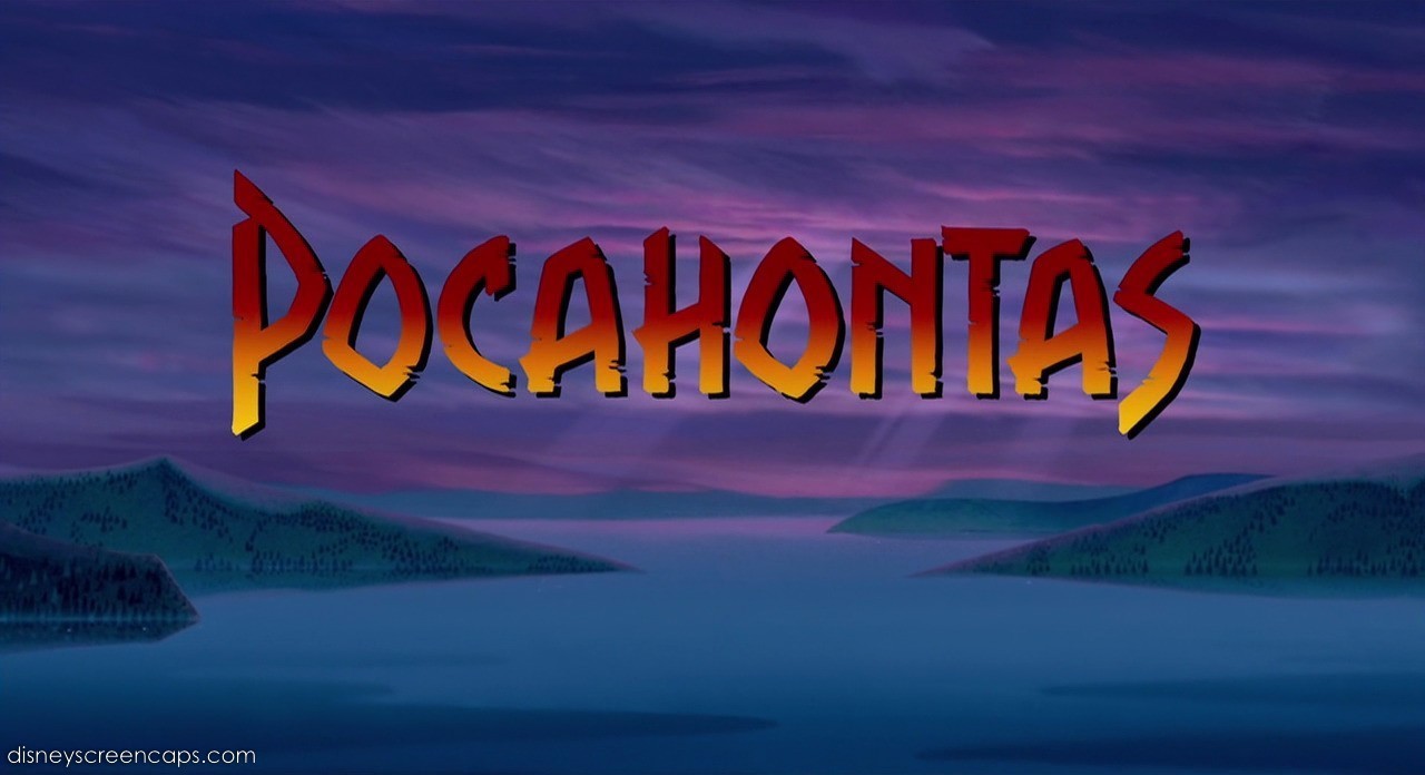
I had hoped this would have gone earlier, I seriously don't like it, the letters are weird and they made some letters big when they are supposed to be small.
Here are some of the comments:
Too boring-dumboisadorable
Apart for the background (which is pretty) the タイトル itself isn't that pretty-CodyVenusTreat
I don't really like the color of the name against the bluish purplish background-BB2010
Pocahontas just looks really boring. Especially the color of the font against the background-NyoHetaliaCreed
I like the others more-tiffany88
I 愛 this title, but the others are もっと見る interesting-katiemac20
Pocahontas is a little bit too much-Radvile
This one dosen't really belong to the 上, ページのトップへ 5. It's kinda boring-Swanpride
I don't like the font-BraBrief
4. Mulan(8)
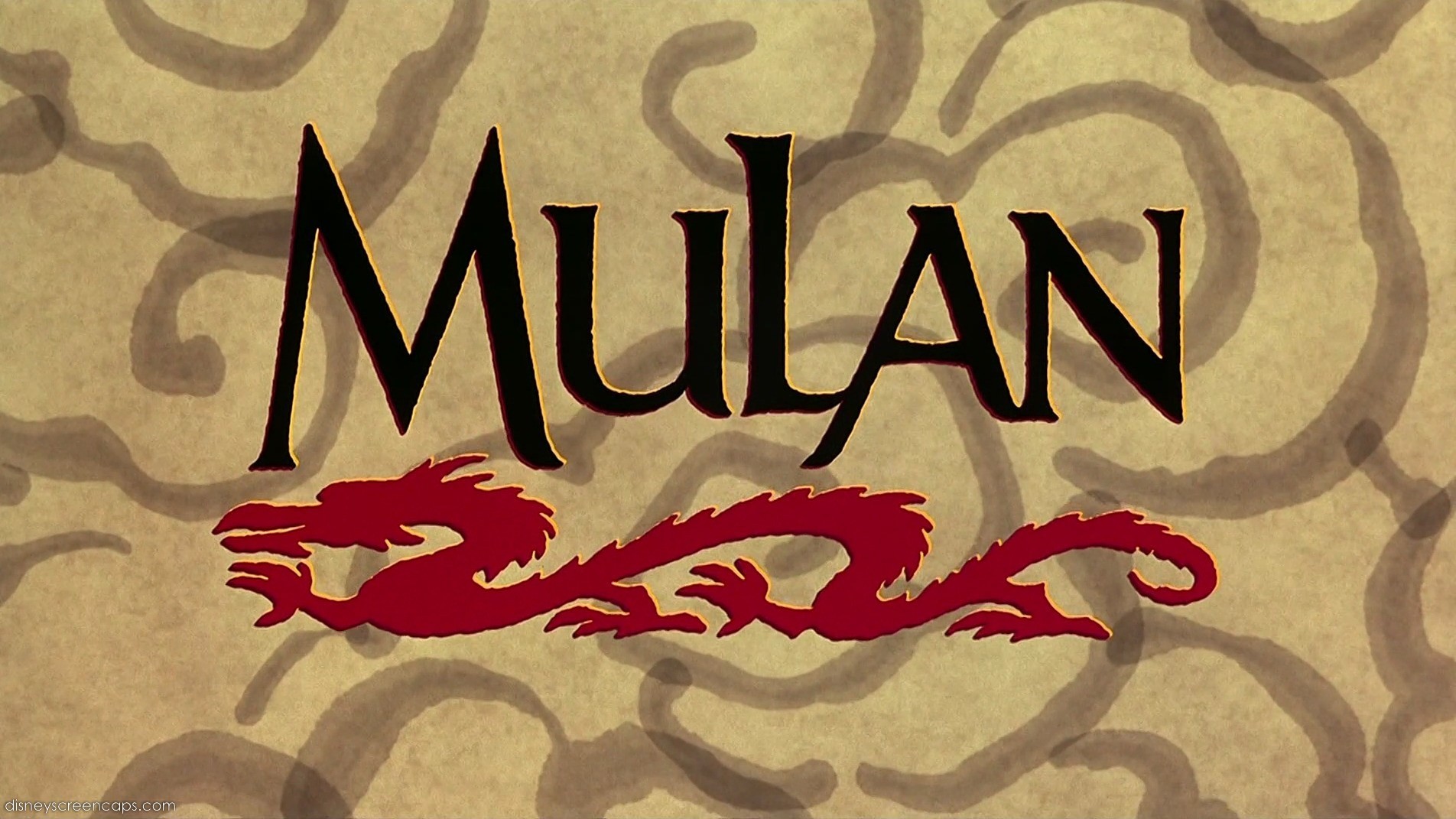
I don't really like the タイトル card, it's so boring because the letters are just in one color, but the dragon is cool and the background is pretty good too.
Here are some of the comments:
The dragon looks pretty, but the name itself looks ugly to me-Hattress
I like the dragon, the lettering is ok, but I don't like the background-opalrose
Dosen't like the background-LightningRed
It's not as good as the others-ladyhadhafang
Nothing special-Animaluco
Except for the dragon, it is nothing special-BelleAnastasia
I like the dragon and the letters aren't that bad, but I don't think it's a good title-martina12345
I like the starting sequence, but the picture alone is not that great-Swanpride
Not my favorite-Blueshoes20
I 愛 them all...but this is my least one...maybe the clouds on bg aren't nice-BraBrief
It's just so bland-TheCrystalRing
I like the dragon, but the タイトル is too plain-CodyVenusTreat
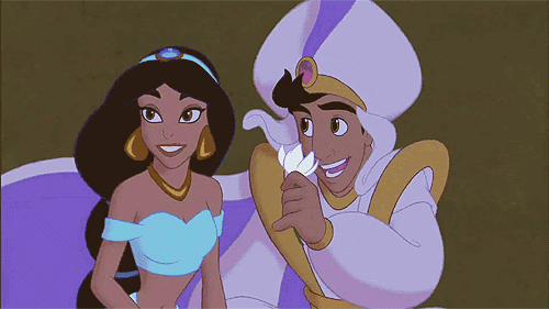
3. Aladdin(6)
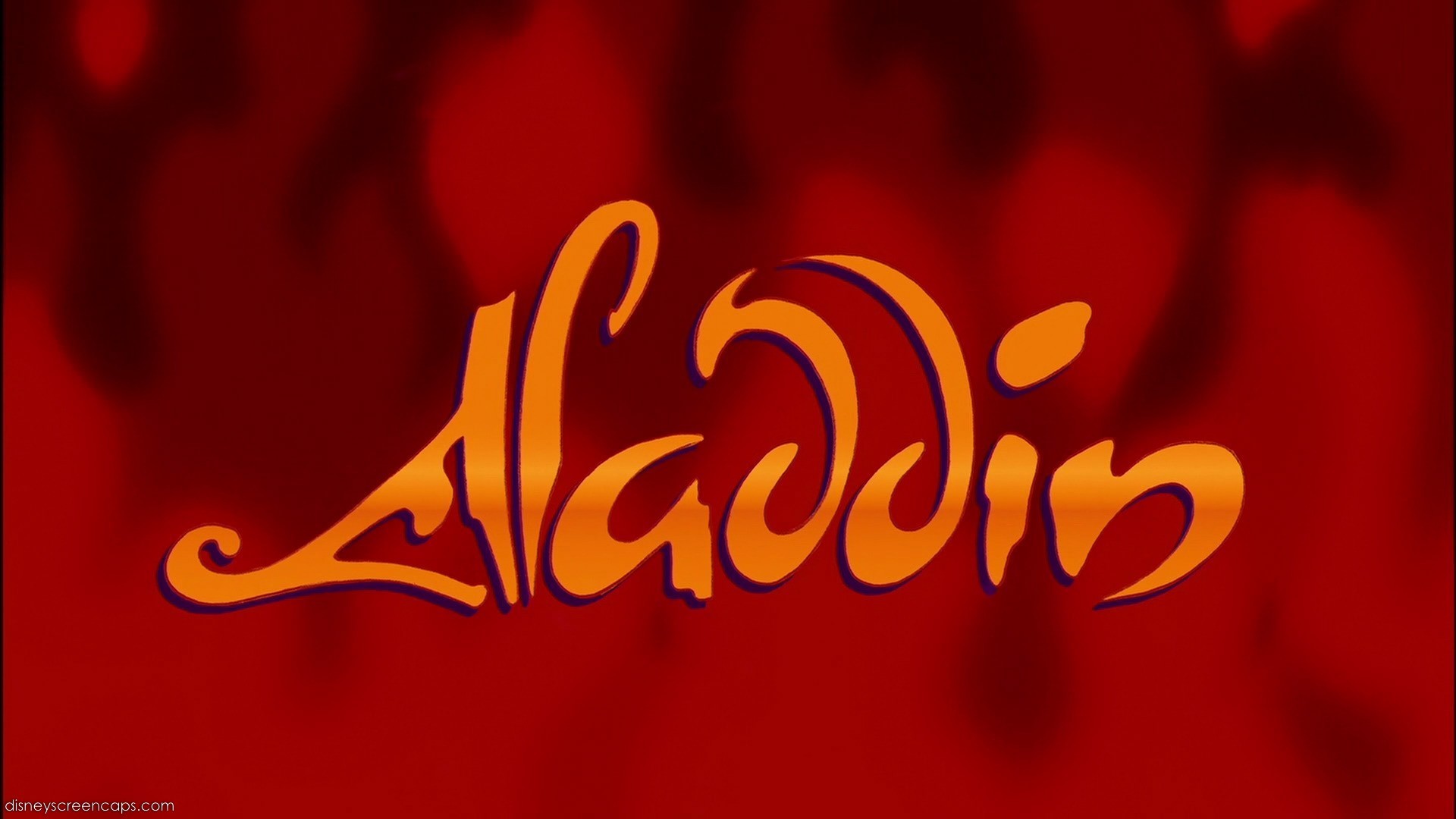
It's cool that it's made of the 火災, 火 in the background, but that also makes the letters almost unreadable.
Here are some of the comments:
This one had the potentional to be so GOOD. I don't know why they chose these colors-heatherswan
Not my favorite-luv_audrey
Don't like it out of what's left-Pink_Love
Little boring-fiina
I like the others better-FlowerBelle
They are all good, but the others are slightly better-tiagah
I think that Beauty and the Beast and The Little Mermaid have もっと見る magic to me-LaSalvatore
I think the others are prettier-Princess_Ella
I 愛 them all...I pick this only because the タイトル is about Aladdin, not Jasmine.. The other contain refers to DP-BraBrief
It's just... ugly looking-ladyhadhafang
I like it, but the other titles are much better-CodyVenusTreat
The others are better, but this one is good-opalrose
I prefer the others-katiemac20
2. Beauty and the Beast(3)
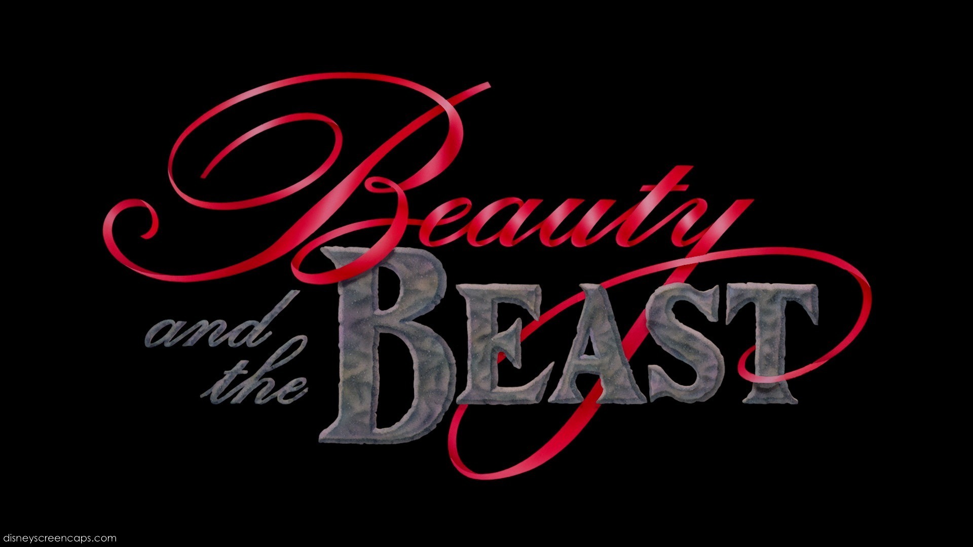
I 愛 this タイトル a lot, it's so luxury looking, a little too unreadable, but I still 愛 it a lot
Here are some of the comments:
The word "Beauty" looks pretty, but that's it-DreamyGal
It's not that special as the others-ariel306842
Eh, I never liked this one-CuteDiana
It just looks a bit bland, that's all-saz19126
I don't like it-Angeelous
Don't like this one as much as the others-BB2010
Too simple...-PrueFever
It's just too... depressing-ladyhadhafang
Too fancy!-Tigressfan10689
The others are better-hisblueeyes
I like the beauty and how it's red, but I don't like how beast is in grey and the background is black-starlight77
The タイトル of Beauty and the Beast もっと見る または less tells the whole story already with the beautiful wrapping itself around the "strong one". It's perfect. And perfectly memorable-Swanpride
Beauty and the Beast is gorgeous! The best one out of all DP titles!-BelleAnastasia
I just don't like how they went all crazy with "Beauty" and then for "Beast" it was just simple, I mean I know that was the point, but I just didn't like it-iHyrule
There where many コメント to choose from so that's why there are so many!
1. The Little Mermaid(4)

And here is the best DP タイトル picture according to you, to me it's great, but my 上, ページのトップへ 3 お気に入り are just so much better, this one is also so plain.
Here are some of the comments:
Kinda bland:/-SailorM91
I hope TLM wins:)-BraBrief
I prefer The Little Mermaid, it's もっと見る simple-Animaluco
The Little Mermaid is so beautiful-Angeelous
I prefer The Little Mermaid. It looks really beautiful-Awinitarose
TLM fits it's background-tiagih
Once again, there where many コメント to choose from, so this is just a few of them!
Please コメント with your own 一覧 of お気に入り タイトル pictures and thank あなた to everyone who participated in the countdown, I'm going to start my Best DP タイトル countdown soon!
so we drove 3 hours from West Palm to Orlando to 移動する into the apartments. I met up with my roommates, who I'd been chatting with on facebook, and got through the application process! It was actually pretty boring, like a 2 時 standard procedure. So here are some pics of our apartment. I don't really get to learn ANYTHING about my job until Friday. It's super warm and pretty.
After we unpacked we went to downtown ディズニー & ate at the rainforest cafe. SUPER FUN!!! really nothing happened today so sorry i'm boring


After we unpacked we went to downtown ディズニー & ate at the rainforest cafe. SUPER FUN!!! really nothing happened today so sorry i'm boring
kitchen! :3
exciting dining room
living room
guess which bed is mine
me on the right, girl i met on tumblr in the middle
me and my roommates, why are we all brunette
that's a cake
me n buzz are dating now, it's cool
this is made out of legos

"It is time to strike back!"